If you consider yourself a designer in any sense of the word, then you probably see design solutions that just gets on your last nerves.
Today, I installed IE 9, which I’ve been avoiding for a little while. I didn’t want to update but I needed to for the sake of my website. I could have waited until Microsoft institutes their automatic browser updates in January 2012, but I figure what the heck, I can test out the new version now. The first thing you notice is that web browsers are starting to look the same, particularly the minimalist design with tabs. It’s great to try to get more screen real estate and to get rid of unnecessary crap, but some things are being hidden in secret menus.
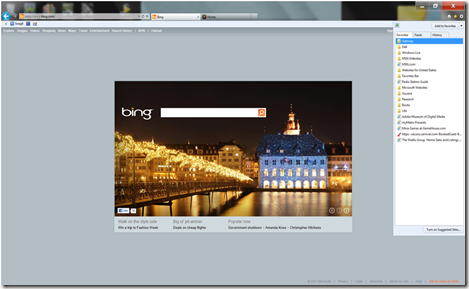
Anyhow, IE9 has changed the favorite icon from star and words to just a star and moved it from the left of the screen to the right of the screen. There’s nothing wrong with this. It seems to make sense and now it looks like Chrome and Firefox which would suggest some consistency. When you click the star, the favorite menu appears.
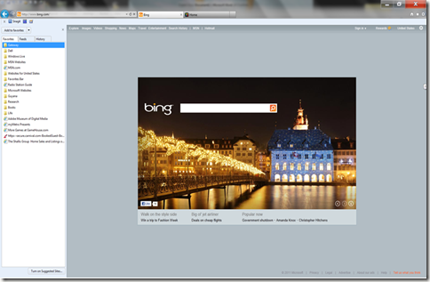
However, the problem occurs when clicking the button to pin the favorite menu to the browser. Now, I expected it to pin it to the browser where it appeared (I was ready for that change), but instead it flew across the screen and pinned it to the left side of the screen.
It seems that they designed the buttons for the right side of the screen but didn’t move the previous functionality to match the new design. Why move the buttons to the right at all if everything will still occur on the left with no design changes? Why mess with the user’s expectation?
It’s possible that I’m the only person that uses this functionality so it’s a pet peeve, but I’m guessing that they kept it around because I’m not the only one that uses it.
Possible Solution: Either pin the favorites to the right side of the browser or move the buttons to the left side. Don’t do both!


